


Founded in 1932 as a small family-owned business, Tower Optical is a historic American brand manufacturing the iconic binocular viewers found at the nation’s most famous landmarks. These viewers have become a permanent fixture at scenic destinations ranging from the Grand Canyon and Niagara Falls to the Empire State Building and various state parks. While the company has maintained a 90-year legacy of quality, their recent growth necessitated a brand evolution that could translate their physical presence into a strong digital and web environment.


The primary objective for L+R was to balance the brand’s storied heritage with a modern aesthetic that resonates with today’s digital-first audience. We needed to communicate high-precision engineering and craftsmanship while also reflecting approachability and exploration. Creating a recognizable logo based on the viewer's silhouette proved a specific challenge—a piece of hardware that, while iconic in situ, is not an everyday object.


Our strategy team and design team conducted a branding sprint to explore divergent concepts that bridged the gap between hardware and digital interface. We landed on a visual identity featuring a single red accent color, a direct nod to the mechanical details of the physical device, paired with an earthy palette reflecting its outdoor environment. The final logo utilizes a striking silhouette of the binoculars, with secondary brand elements drawing inspiration from the industrial shapes and textures of the hardware. To ensure a humanist connection, the brand photography direction captures the Tower Optical experience through varied perspectives: the views seen through the lenses, the devices in situ, and the people engaging with the equipment.
The updated brand identity now serves as the foundation for Tower Optical’s digital storytelling across their website and social media channels. By unifying the physical product's iconic design with a cohesive digital language, the company can now effectively communicate its history of American craftsmanship to a global audience. This strategic alignment of legacy and technology ensures that the brand remains a recognizable symbol of discovery for the next generation of travelers.


More Content You May Enjoy
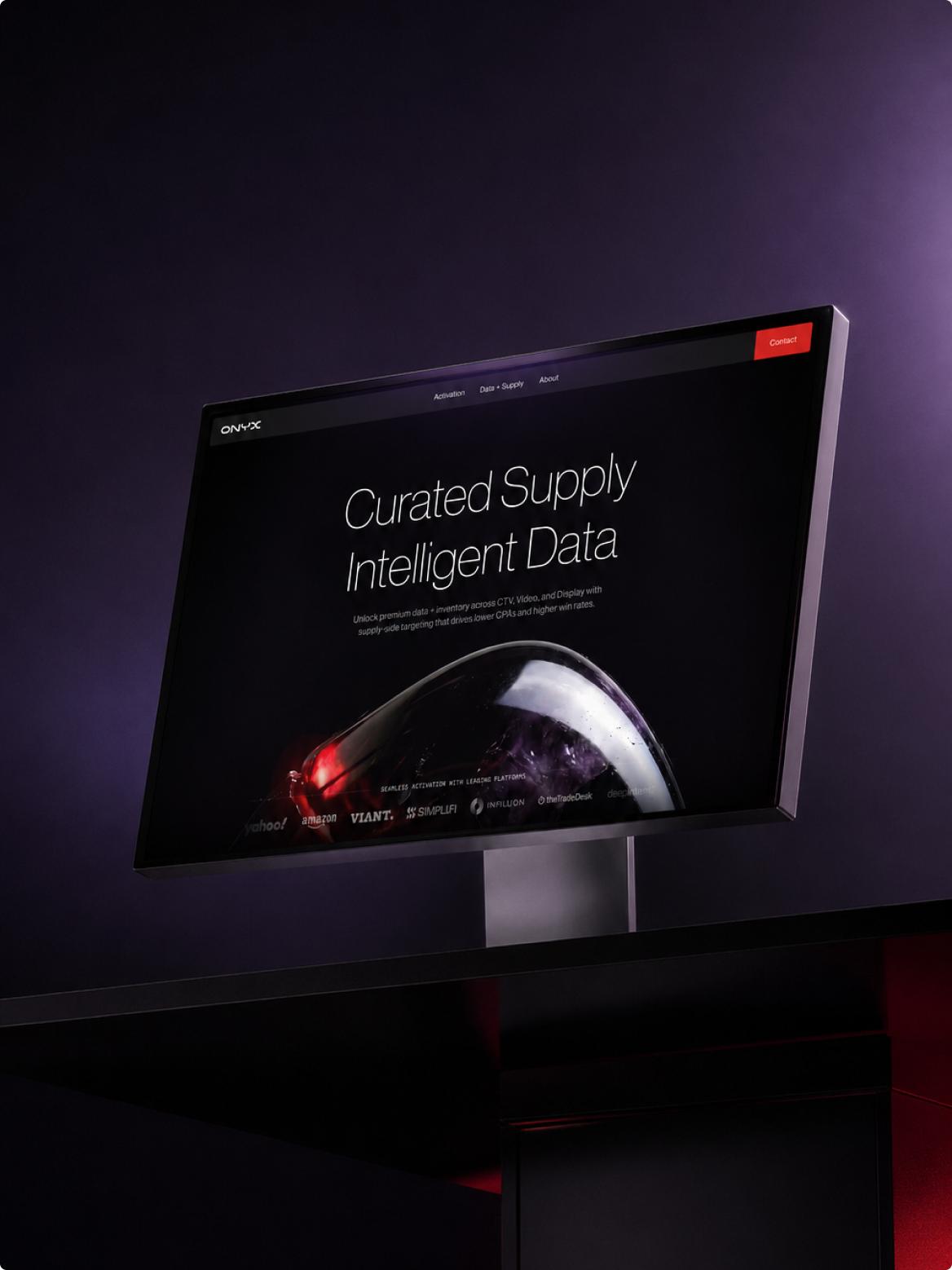
ONYX
A scalable brand identity system with integrated agentic design deliverables


Introducing Ephemeral Perception: A Privacy-By-Architecture Framework for Smart Glasses Developers

Brush Coach
A silly, yet functional tooth brushing coach, built for Meta Ray-Ban Display glasses


Takeaways from Shoptalk Europe 2026: Agentic commerce moves from promise to operating model
